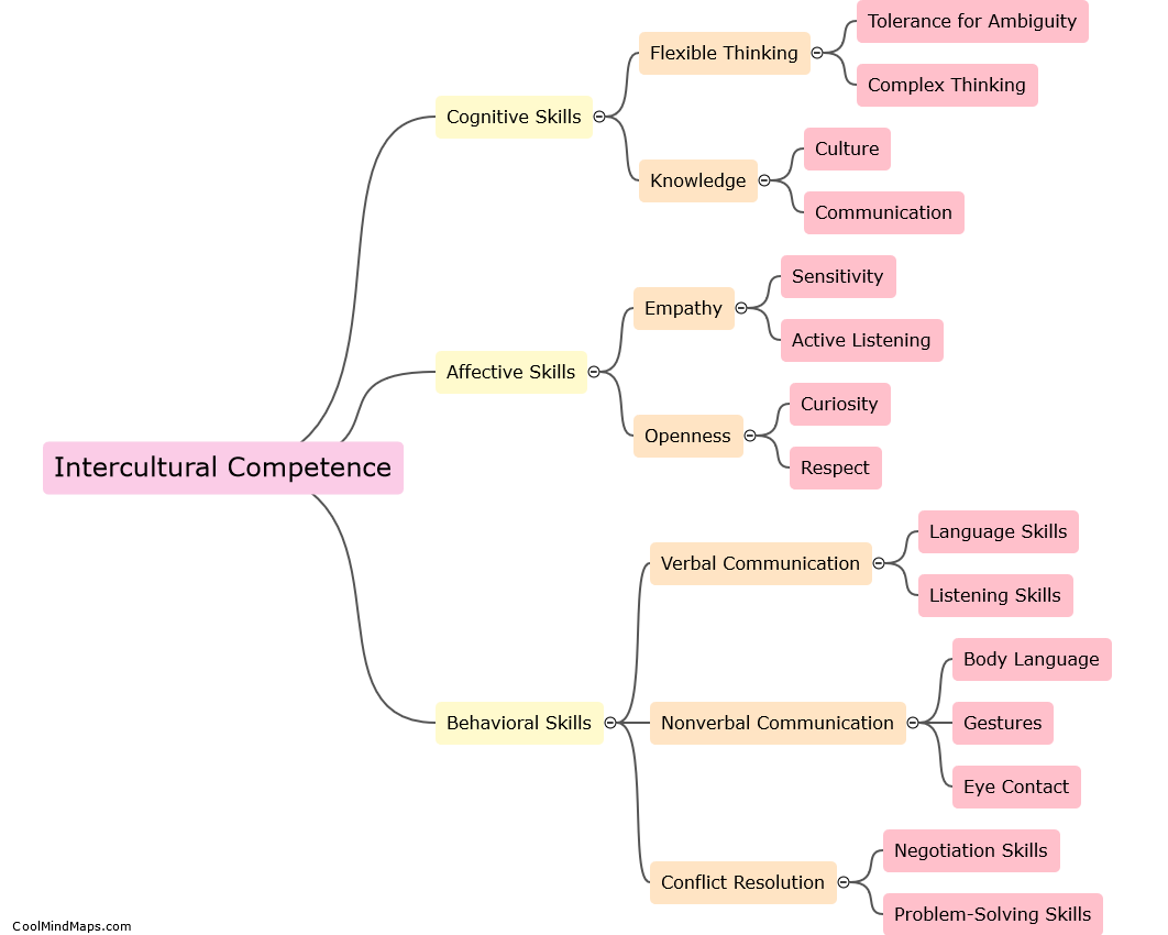
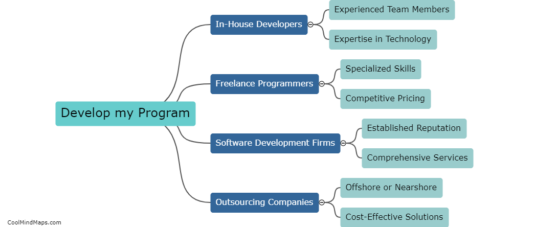
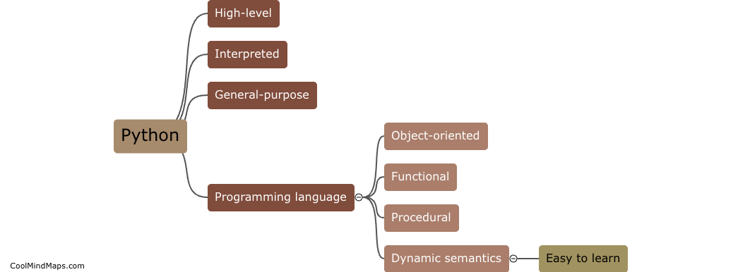
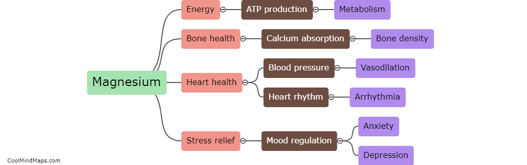
Methods of data visualisation
Methods of data visualisation refer to the various techniques used to present information in the form of graphs, charts, and other visual formats. These methods can be used to simplify complex data sets and make them easier to interpret, enabling the viewer to quickly identify patterns and trends. Some common methods of data visualisation include histograms, pie charts, line charts, scatterplots, and heat maps. The choice of method will depend on several factors, including the type of data being visualised and the intended audience. Effective data visualisation can be a powerful tool for communicating complex information to a broad audience in a clear and easily understandable manner.

This mind map was published on 31 May 2023 and has been viewed 165 times.