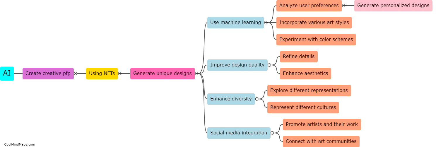
How can color theory be applied to create a visually appealing pfp NFT?
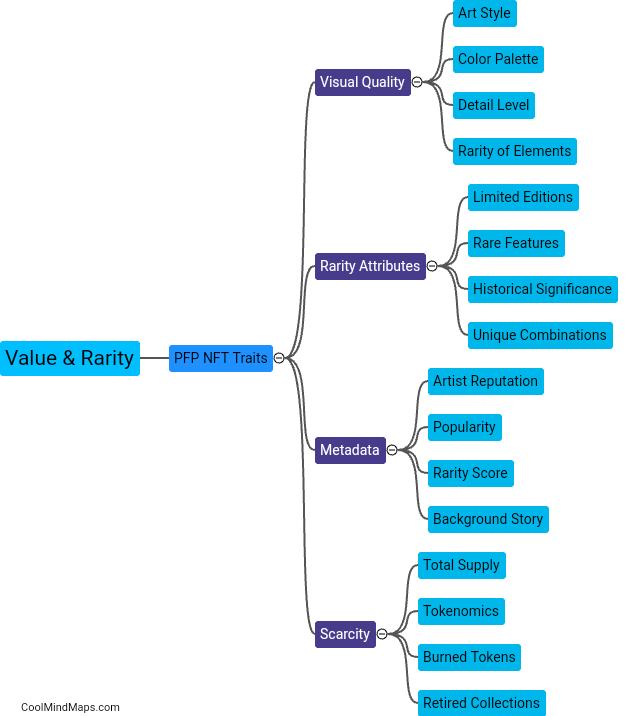
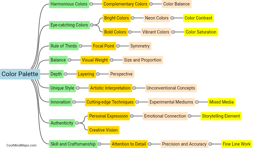
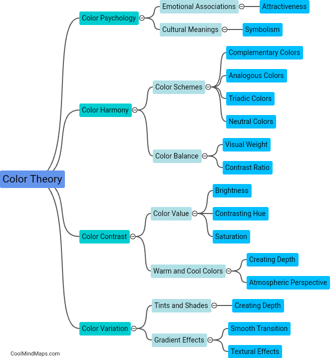
Color theory can be effectively applied to create a visually appealing pfp (profile picture) NFT (non-fungible token) by utilizing the principles of color harmony, contrast, and psychology. By carefully selecting a color palette that harmonizes well, such as complementary or analogous colors, the pfp can create a sense of visual balance and unity. Additionally, incorporating contrasting colors in the right proportions can add vibrancy and visual interest to the artwork. Understanding the psychological impact of different colors is also crucial, as specific hues can evoke certain emotions or create associations in the viewer's mind. By effectively applying these color theory principles, a visually appealing pfp NFT can be created that catches the viewer's eye and conveys a desired aesthetic or message.
This mind map was published on 19 August 2023 and has been viewed 103 times.
