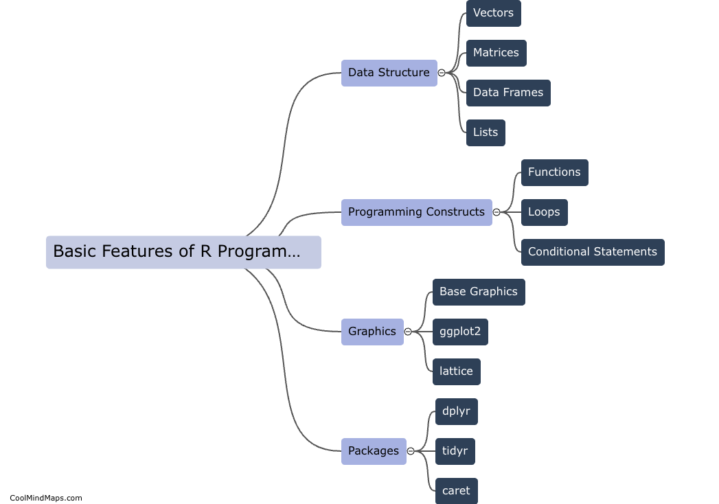
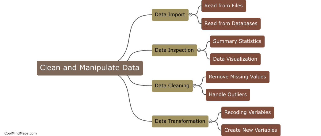
How to create data visualizations in R?
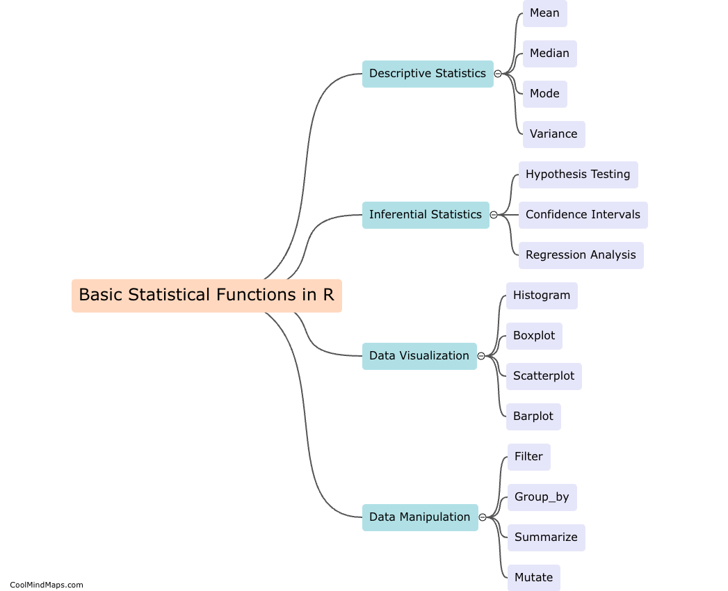
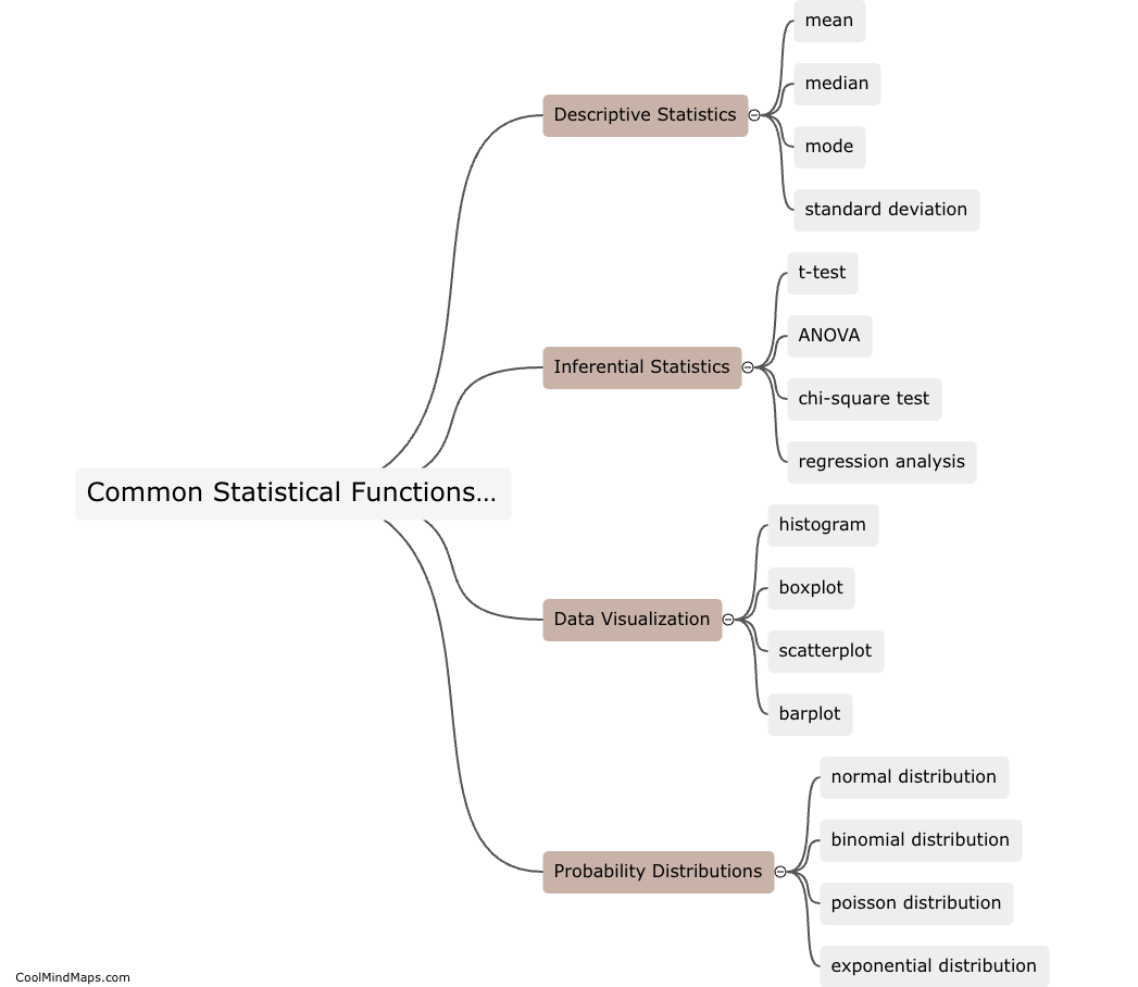
Data visualizations in R can be created using a variety of packages such as ggplot2, plotly, and lattice. To start, you can load your data into R using the read.csv() function and then use functions within the chosen package to create various types of plots such as scatter plots, bar graphs, and line charts. Customization options are available to adjust colors, labels, and axes to best represent the data. By experimenting with different plot types and aesthetics, data visualizations in R can effectively communicate insights and trends to help with data analysis and decision-making.

This mind map was published on 15 May 2024 and has been viewed 69 times.